
Updated Personal Design, Post-Bonding Tour
CICEL Bonding Tour
BRIEF OVERVIEW
Client: Winona State University / Minnesota State Legislatures
Problem: Create a physical takeaway for state legislatures as part of the bonding tour, aiming to motivate their support of project funding. Ensure that the cost for each takeaway item remains below $5.
Medium: Living Hinge Laser-Engraved/Cut Wood, Cotton Paper, Illustrator
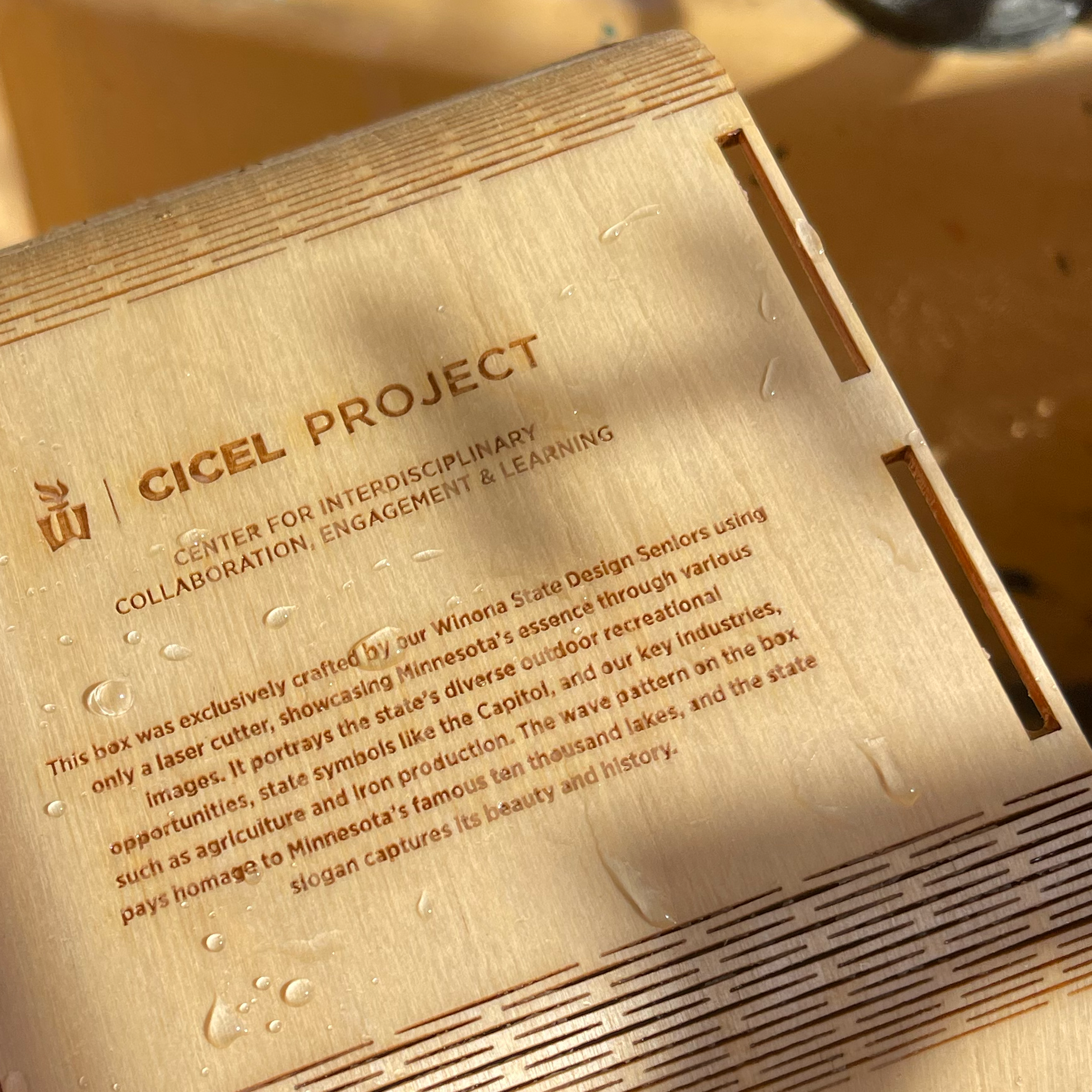
Description: Winona State University tasked us to conceptualize and craft a tangible takeaway for state legislatures during the bonding tour. The CICEL bonding project encompasses a $25 million state budget allocated for the implementation of a new sustainable building initiative on the WSU campus. This project was created in collaboration with Pierre Gage, Alex Trainor, Arin Hendrickson, Jadyn Niemeyer, & Katelyn Cutshall.
Scroll Down for Full Case Study

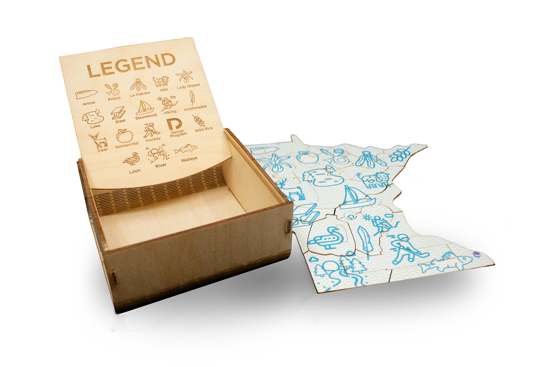
Living Hinge & Glue-less Locking System Mechanism
Client
Winona State University / Minnesota State Legislatures
Problem
Create a physical takeaway for state legislatures as part of the bonding tour, aiming to motivate their support of project funding. Ensure that the cost for each takeaway item remains below $5.
Role
Project Team Lead / Collaborative Designer
Solution
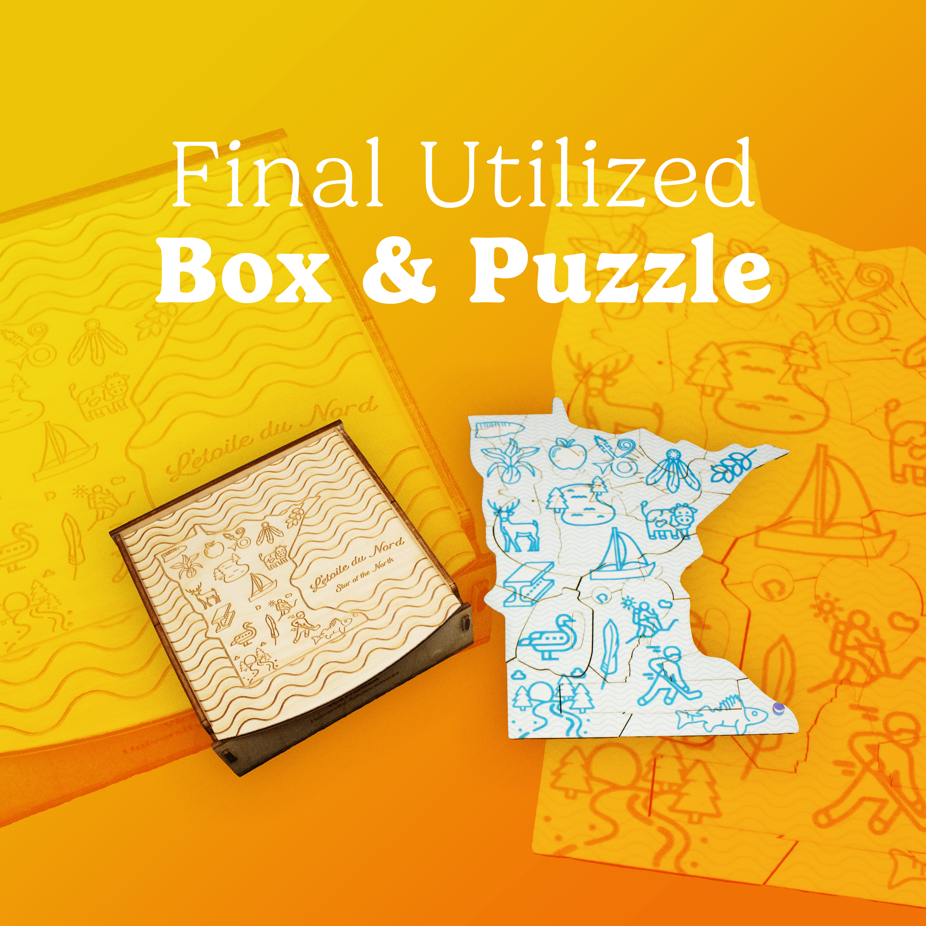
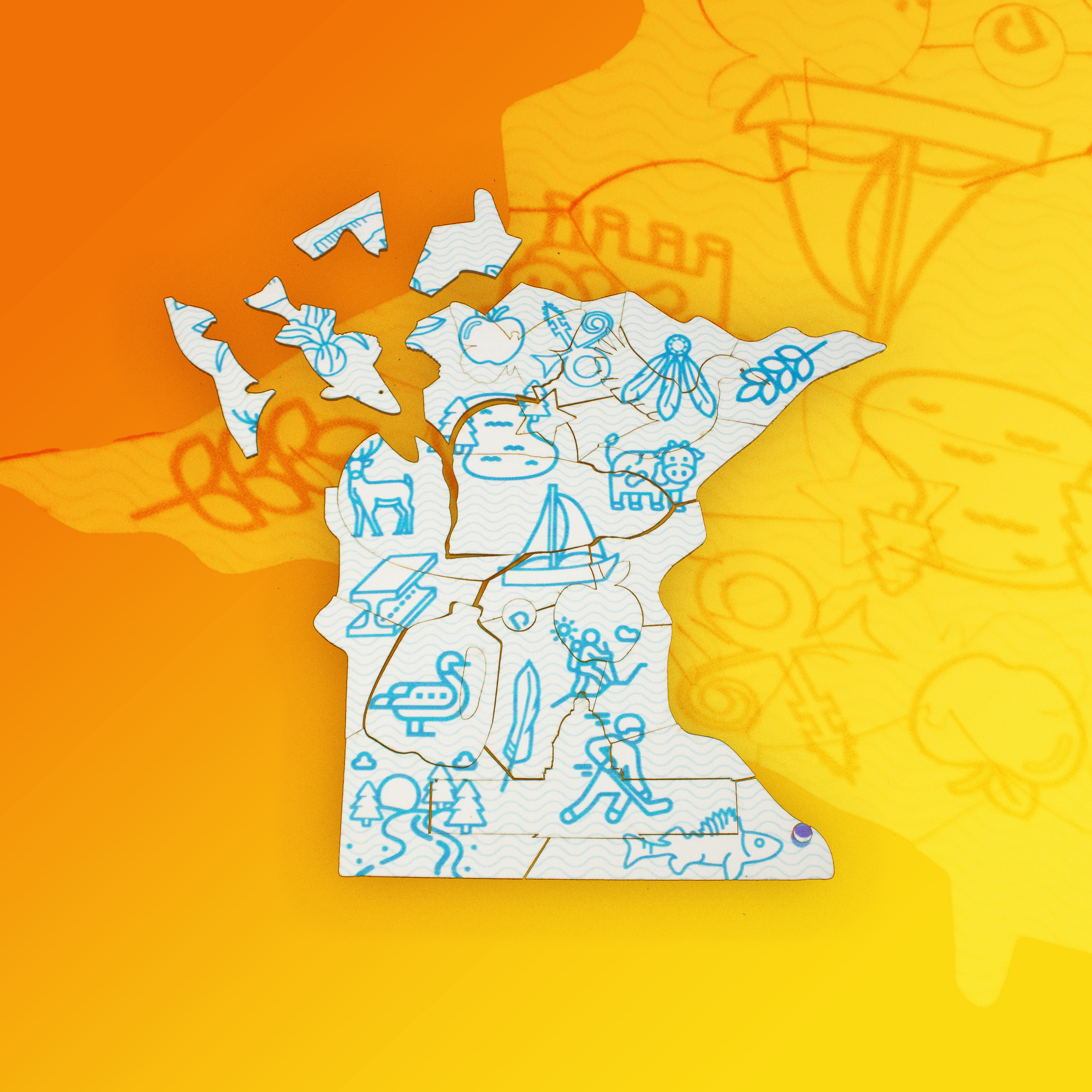
Our student design team collaborated to craft a slide-top box featuring a laser-engraved living hinge and a sliding stop mechanism. The box houses a spiral-bound press packet and a cotton coaster puzzle shaped like Minnesota.
The multimedia press packet within offers a curated, multifaceted experience and includes symbols paying homage to unrepresented native communities. It engages through various media forms, creating an immersive encounter.
Moreover, we introduced a laser-cut, inkjet printed cotton coaster puzzle that, along with the box, highlights Minnesota's essence. The design celebrates outdoor opportunities, iconic landmarks like the capitol, and key industries such as agriculture and iron production. It incorporates spearhead and feather iconography, symbolizing Minnesota's two main tribes, and a dreamcatcher as a protective and symbolic element preserving Indigenous spiritual traditions. The wave pattern on the back nods to Minnesota's famous ten thousand lakes, while the state slogan encapsulates its beauty and history.
This piece serves a practical purpose, showcasing our attention to detail and dedication to merging functionality with aesthetics.
Identifying what I did not like about the final design, the parts I could not facilitate compromise on in a collaborative setting, and what shortcomings the final product had; I wanted to create a new design in the end of semester time I had allocated for updating this project. I had initially planned on collaborating with a peer on a second iteration of this project. Unfortunately, we were both very busy by semester's end due to the amount of responsibilities we both had. I know I personally did not have the time or emotional bandwidth to collaborate on a project of that scale, knowing the toll that collaborative projects usually have on me. What I identified is as follows:
| Our original puzzle design, which was the blue of the icons, helped to hide the burn marks on the puzzle. The stark white of the final design highlights the yellowed edges. Initially, my peers and I believed that crafting the puzzle from wood, inspired by the original Big Stick Co. box, would result in a higher quality and more enduring gift for the legislators. Unfortunately, the limited amount of wood provided by our instructor, Chun Lok Mah, posed a challenge. Moreover, the team faced difficulties with timely file submissions, iterations, and contributions, hindering our ability to conduct materials testing and prototyping. When questioned by a peer about using wood, I was surprised by the lack of awareness regarding the project's limitations and current constraints.
| A team member highlighted the importance of including indigenous peoples, and this same member created the icons representing La-Dakota, Arrow, Anishinaabe, and Prince. The main challenge within the group revolved around establishing and adhering to a consistent style for everyone's contributions. However, due to the diverse composition of our group, achieving this cohesion proved difficult in the final product.
| Ensuring quality assurance in this project proved challenging, primarily due to the project's large student group. A subset of students, who remained uninvolved and were consequently not recognized as contributors, further complicated matters. We had to convey a complex set of instructions for producing approximately 60 boxes for mass production. Massive kudos to Arin Hendrickson for creating a comprehensive document of instructions for our group members to follow. The primary factor contributing to these difficulties was the lack of commitment to the project, resulting in insufficient contributions and poor attendance at group meetings.
Process
Our class tackled the CICEL project with a clear mission—two groups, two roles, all for an imminent legislative tour. My group aimed to create a compelling takeaway for legislators to secure funding for a new campus building. Internal tensions arose, and as the project progressed, I assumed responsibility for both tasks—designing a box with a living hinge and a puzzle on thick coaster cotton paper. Navigating collaboration was challenging, demanding extra effort to execute and refine work.
Proximity Dynamics: Despite geographical challenges, our group dynamics transformed when we realized inactive participation would impact portfolio development. This realization propelled the team into high gear, showcasing the transformative impact of clear expectations and accountability.
Detail Dynamics: Examining collaboration on details and strategic discussions revealed challenges in ensuring an equitable distribution of responsibilities. The struggle to motivate some members persisted until a midpoint update reignited commitment. This intervention underscored the importance of meaningful contribution beyond brainstorming, emphasizing the need for clear expectations and shared accountability.
Reflect
Upon reflection, because of the collaborative nature of our mid-sized group, once the project had concluded, I reevaluated our project direction. Seeking to shift away from Minnesota's initial iconography emphasis, I refined the design—engraving topographic patterns on both the box and puzzle. This strategic pivot involved a significant departure from the original plan, envisioning the aesthetic elements cut and engraved from wood. The revised design aimed to capture Minnesota's essence through its topography, emphasizing its ten thousand lakes and intricate water systems, including the Mississippi River's meandering path, engraved the deepest. I reworked the state slogan typography to be more emblematic of sophistication, reinforcing the connection for Minnesota legislatures between visual elements and Minnesota's cultural identity. Focusing on topographic patterns aimed to offer a unique and meaningful representation, transcending conventional iconography use. This reflection highlights the iterative nature of the design process, emphasizing adaptability and openness to refining creative direction, going back and revisiting the concept on my own, utilizing everything I learned from working within the group dynamic.